Color Psychology in Design: Harnessing Emotion to Drive Action

Color psychology is a fascinating aspect of design that delves into how different hues evoke emotions and influence human behavior. In the world of design, color goes beyond mere aesthetics; it serves as a powerful tool for conveying messages, eliciting reactions, and ultimately, driving action.
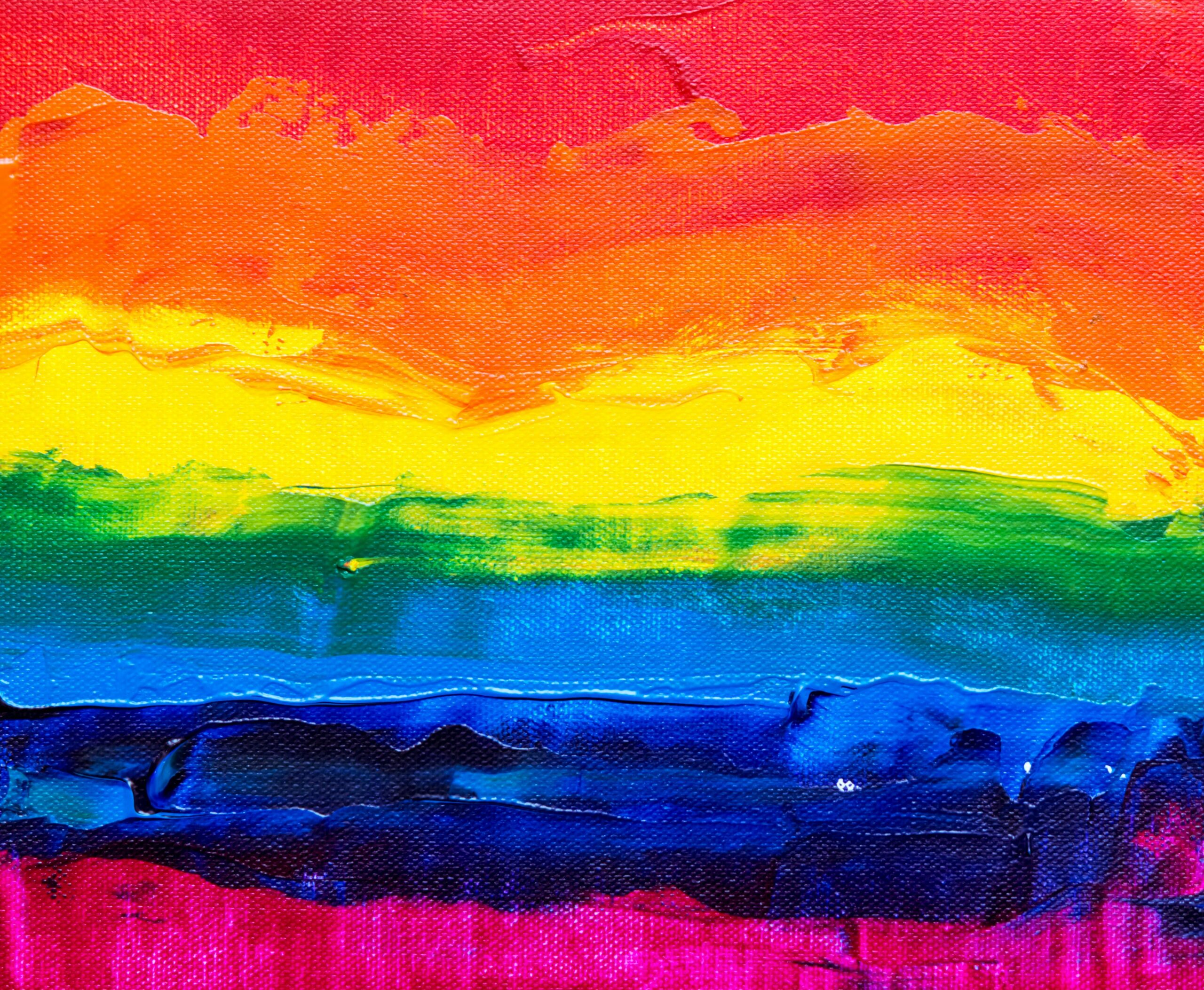
Understanding the psychological effects of color allows designers to strategically select palettes that resonate with their target audience and align with the goals of their project. For example, warm tones like red and orange can evoke feelings of excitement and urgency, making them ideal for call-to-action buttons or promotional materials. On the other hand, cool tones like blue and green are often associated with trust and tranquility, making them well-suited for corporate branding or healthcare-related designs.
Moreover, cultural and contextual factors also play a significant role in color perception, further emphasizing the importance of thoughtful color selection in design.
By harnessing the principles of color psychology, designers can create experiences that not only look visually appealing but also resonate on a deeper emotional level, compelling users to take desired actions. Whether it’s making a purchase, signing up for a newsletter, or simply engaging with content, the strategic use of color can significantly impact user behavior and drive meaningful results.